In our last
workflow article we showed how to use
the Photoshop histogram during the editing process. Some readers complained
that we did not show the final histogram. They were so right! Here
is the histogram:
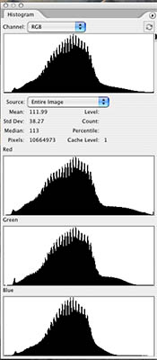
Final Histogram for workflow 98 article
At first it does not look that bad except
of some minor clipping in the red channel. But this was not minor at
all
as our prints showed. Here is a crop that shows the effect:
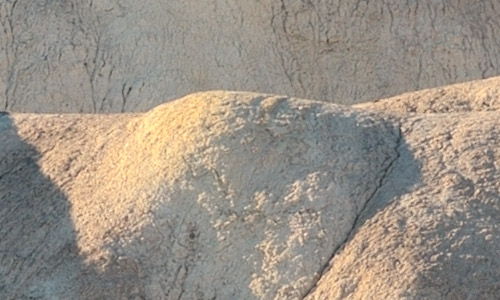
100% magnification crop of the wf98 article result
We find 2 issues with these highlights:
- We call them to aggressive (or hot)
- They have this yellow tint
We could back an redo the image but we tried to fix it.
1. Toning down the highlights
First we reduce the highlight output level a bit (maybe
241 is even too strong) 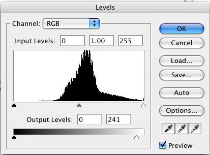
Toning down the highlights

After Levels
Unfortunately this operation darkens all areas of
this image. That is why we apply a highlight mask (create with our
own Tonality
Tuning Kit) to reduce the effect to the highlights only:
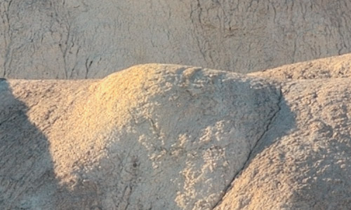
Highlight mask applied
Tip: Open both images in Photoshop and add one as a layer on top
of the other. This way you can see better the subtle but relevant
differences.
2. Reducing the Yellow Tint
Now we need to reduce the yellow tint. We create a Hue/Saturation
adjustment layer:
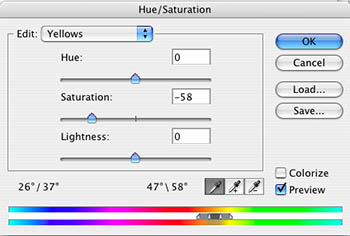
Hue/Sat layer
Tip: Best you can lean how to create such a selective
saturation correction from this article
based on a Ben Willmore technique.
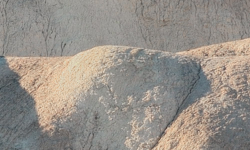
After Hue/Sat layer
Unfortunately this operation not only
desaturates the highlight areas but effects the rest of the image.
What is the solution? You guessed it: restrict the layer just again
to the highlights (we actually use the same highlight mask as before):

Our start version
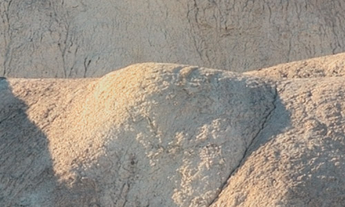
Final tuning
This time we won't forget also to show
the final histogram:
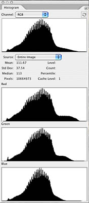
Histogram of the final image
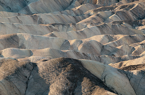
Final image
Highlights provide a much wanted
sparkle in our prints but we never want them to be too harsh. |