Color spaces
One of the subjects I receive numerous
questions about is which color space I use. Well, here is the answer:
my color space of choice,
as well as the one I use virtually for nearly all my photographs,
is Chrome Space 100, Joseph Holmes.
The choice of color space
is a subject on which there is a certain level of confusion. What
I want to do in this essay is answer
some of the most
frequent questions I receive to shed light on this subject.
We
will also be addressing this subject, hands-on and in person, with
Uwe Steinmueller, Joseph Holmes and myself during the Fine
Art Digital
Photographer’s Summit this year in November. There is only
so far you can go with an essay, and eventually attending a workshop
such as
the Summit is the best way to study, practice and return home
with the skills you need to take your work to the next step.
Everyone’s
work is different, and at some point you have to have an expert
look at your work and answer your questions personally, face
to face, while
looking at your prints.
This being said let me address some of
the most common questions regarding color spaces.
Question 1:
If I am using Adobe RGB in the camera, what is the point
of using a wider color space like Pro Photo RGB in Photoshop? I shoot
everything in RAW.
So does that mean that I am actually capturing the entire
Pro Photo RGB color range in the camera in the RAW format even
though the
camera is
set to Adobe RGB?
No. What you are capturing are the colors
that your digital camera can record, independently of the color space
(or
color balance
for that matter)
you select in the camera. A RAW file is not an actual
photograph until it has been converted in a RAW converter. Until then
any color information
is only tagged to the RAW file and later interpreted
by
the raw converter using either the choices made in the camera
or the
choices made in
the raw converter. The tagged information is only a "recommendation" made
by you, or by the camera, at the time you took the photograph.
When
you convert your photographs you are free to chose any
color space and color balance you like. Clearly, choosing
a wide color
space is to
your benefit, which is why some photographers use ProPhoto
RGB and why I use Chrome Space 100. If you do not indicate
a color
space
or color
balance during raw conversion then the raw converter will
either use the choices that were tagged onto the raw file
in the camera,
or use
the default choices set in the RAW converter.
A color capture
device, i.e. a camera or scanner, does not capture color in any given
color space nor are the
colors
captured by
this device designed
to fit a specific color space. The goal of a color capture
device is to capture as many of the original colors as
possible. It
is then the
responsibility of the user to save the image in a color
space large enough to store all the colors captured by
the camera
or the scanner.
Think of the color gamut in an image
capture as a collection of items you are bringing back with you from
a trip.
Once home you
need to
store these items somewhere. You choose a storage space.
Hopefully this space
is large enough for you to put everything in there
without any problem. However if the space is too small to store
all your
items you will
have to throw some of them away. It is the same with
image captures and color
spaces. Unless you use a color space able to store
all the colors in your original capture, some of these colors
will
have to be
thrown away.
To me the real question is why Canon (and
other manufacturers) does not offer the choice of a wide color space
in
their cameras since
Adobe RGB
is not able to represent all the colors that the
1DsMk2 is able to record.
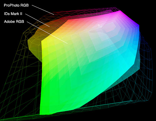
A graph showing the respective size of the ProPhoto
RBG (wire frame), 1DsMk2, and Adobe RGB (on top)
color spaces.
The
1DsMk2 space fits
nicely in the ProPhoto RGB space. The Adobe RGB space
on the other hand only
covers part of the 1DsMk2 space meaning that some
colors captured by the 1DsMk 2 will be lost if photographs
are converted to
Adobe RGB. This
graph, and the others in this essay, was created
in
Chromix ColorThink.
Question
2
What is the advantage of using Chrome Space 100
Joseph Holmes instead of Adobe RGB or ProPhoto RGB?
I use Chrome Space 100 for several reasons. First,
it is a wide color space, wider than Adobe RGB.
Two, it
is the
same
color
space I use
with scanned film, thereby simplifying my workflow.
Three, this color space
includes Chroma Variants, which allows me to increase
or decrease saturation by changing the color space
rather than by using
Photoshop Color Saturation
sliders. I find that using the sliders changes
not only the saturation (chroma) but also the hue and
the brightness
of
each color. These
changes are subtle, and are more noticeable with
some images.
However, they
are unwanted changes, and having a solution that
cancels them out –namely
using Chroma Variants instead of the sliders- is
a singnificant improvement.
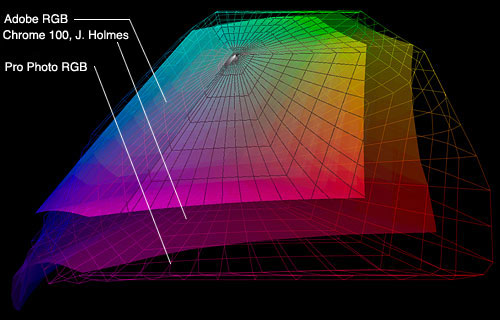
The regular Chrome
Space 100 color space together with two Chroma
Variants: +50 saturation (represented
as
a wire frame
in the
graph) and –50
saturation (represented as a solid color in the
middle of the graph).
Chroma Variants is
something that I have only found featured in this specific color
space. I may be
wrong, and there
may be other
uses
of the same concept out there that I don’t
know about. Chroma Variants are basically color
spaces that are variations of the original Chrome
Space 100 color space. Each variant is either more
or less saturated
than the original color space. The saturation changes
are done in 6% increments. There are 36 Chroma
Variants total. 18 are oversaturated
variants and 18 are under saturated variants when
compared to the original color space. The total
saturation variation available through the 29
Chroma Variants goes from +99% to –99%. The –99%
variant gives you a black and white photograph.
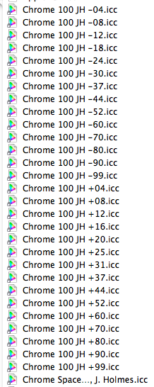
The list of Chroma Variants is located under Edit > Convert
to Profile in Photoshop CS2
To change to a new Chroma
Variant you use Photoshop “Assign Color
Space” command and choose the Chroma Variant
of your choice in the drop down menu. Clicking
the preview button in the dialog box enables
you to see the changes before clicking OK.
My workflow
is to scan my films or convert my Raw files to
the main Chrome Space 100 color space,
then change
to the
Chroma variant of
my choice
in Photoshop using the Assign Profile command.
This color space is available for $100 (for all
29 variants) by emailing Joe Holmes at jh@josephholmes.com
You can
also read additional
information
and download a PDF file with detailed information
about this color space at http://www.josephholmes.com/profiles.html
Note that a free color
space called Ekstaspace PS 5 is available for download from
this link.
Although
it will
give you a
good estimate of the nature of Holmes
Color Space, this free color space is not comparable
in quality to the one for sale. It also does
not include
Chroma
variants.
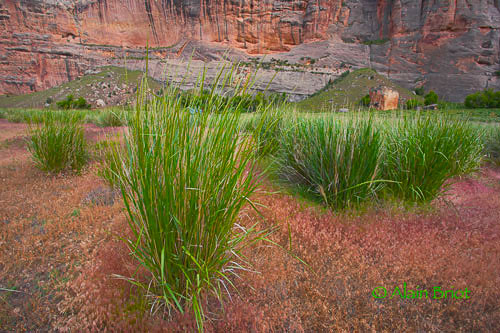
A photograph converted from RAW to
the standard Chrome Space 100 color space
(no Chroma Variants used)
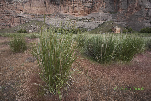

The same photograph converted
from the regular Chrome Space 100 to the -50 sat. Chroma Variant
(top) and +50 sat. Chroma Variant (bottom). The difference is
very noticeable
and only due to color space changes. No other adjustments were
made to the image. To get this effect without Chroma Variants
you have
to use the Saturation controls in Photoshop.
Question 3
In your article on the new 1dsMk2 Canon camera, you mentioned
that you use Joseph Holmes' Chrome Space 100. I've tried his
free Ektaspace
PS 5 as well as the ProPhoto space recommended by Bruce Fraser.
I've found the ProPhoto to be both more saturated and more
luminous, so
naturally, I'm wondering if it's worth the money to buy Joe's
for-sale color space files.
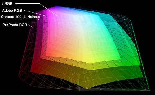
A graph of the sRGB, Adobe RGB, Chrome Space 100 and Pro Photo
RGB color spaces created with Chromix ColorThink. I used different
renderings
for each color space to show how they visually compare to each
other. A visual representation such as this one is the best
way to visualize
the respective size of each color space.
As I just mentioned
there is a significant difference between the free color
space available on Joseph Holmes web site and the one for sale on
the same site.
I use the one that is for sale, not the free one. There is
no doubt that
the free space will not deliver the same quality results.
As usual, you get what you pay for.
On the subject of ProPhoto
vs. Chrome Space 100, I converted the same RAW file with Capture
One into both color spaces and
I could
not see
a difference when comparing the two resulting photographs in
Photoshop. This may be due to how many colors my monitor can
reproduce or to
my choice of photograph. It is also possible that I will get
different results with different photographs, especially with
photographs that
have a particularly large color gamut. However, my belief is
that since
both are wide gamut color spaces the differences are not very
noticeable. The main difference between these two color spaces
are the Chroma
Variants that come with Chrome Space 100. The other difference
is that ProPhoto
RGB is a larger color space than Chrome Space 100. Logically,
a larger color space is able to hold more colors and therefore
should show
a difference in color quality. However, as I said, I have not
seen a
difference so far. But, to be completely thorough, and not
loose colors in my photographs, I now convert many of my RAW
files
to both color
spaces. This is easy to do in Capture One since you can create
several conversion setups, save them under different names
in the Process
Tool dialog box (on Mac OSX), and then elect to have the same
photograph converted to any number of these different setups
as you like, simply
by selecting the ones you want to convert to. You only need
to click the Process Image button once and the photograph will
be
converted
into two different TIFF files automatically, one file for each
color space in this instance.
Note that Chrome Space 100 was
designed for scanned Ektachrome transparencies and not for
converting RAW files. There can
therefore be minor differences
when this color space is used to convert RAW files. However,
in my experience it works very well with both scanned film
and Raw files.
Although it is unlikely, your experience may prove otherwise
and if so make sure to let me or let Joseph know.
Question 4
How do you compare color spaces from a technical
and objective standpoint?
By using Chromix ColorThink or, if you work on a Macintosh,
by using ColorSync Utility. You will have to buy Chromix
ColorThink while
ColorSync Utility is part of Apple OSX.

The ColorThink logo says it all in regards to the purpose
of this software
Chromix is a more complete software package than ColorSync
Utility. However, both allow you to perform the same
functions, which
is comparing color spaces, looking at the technical data
of your profiles
and
study how profiles & color spaces operate and interact.
You can also rename profiles, inspect them, fix errors,
make various
changes etc.
I personally use both tools mainly to study and compare
profiles and color spaces. Doing so is educational and
allows me to
predict how
colors will be modified and eventually how they will
appear in print.
Do not hesitate to email me your questions or comments:
alain@beautiful-landscape.com
Also make sure to visit my website at http://www.beautiful-landscape.com
This is one of the many techniques we will teach during the 2006 Summit.
We will also work with you 1 on 1 and help you with your own images
and with how to use this technique, and many others, in your own work.
Click
here to read a detailed description of the 2006 Digital
Fine Art Summit. Joseph Holmes will join the Summit 2006 as a guest
instructor means you can ask this world class printing expert directly.
About the Fourth Annual Photography & Fine Art Printing Summit
The
4th Photography & Fine Art Printing Summit will take place November
10th to 13th, 2006, in Page, Arizona. Seats are limited. In addition
to studying color
management and color spaces, we will also do field photography in stunning locations
such as Antelope Canyon, Lake Powell and Horseshoe Bend, as well as study Raw
conversion, Photoshop processing, image optimization, printing. We will also
conduct print reviews of your work created during the Summit. Find out all the
details of this unique learning and photographing opportunity on the 2006 Summit
page.
|