Background
The color of inkjet prints varies depending on the color of the light
used to illuminate the prints. Printer profiles are generally made
for “CIE Illuminant D50”. This defines the spectral distribution
of daylight that has a correlated color temperature of 5000 Kelvin.
In nature, you would see this color of sunlight sometime during the “golden
hour” (one hour after sunrise or before sunset). However, prints
are generally viewed under other kinds of lighting, such as incandescent
and fluorescent bulbs. I became aware of this issue when I took my
carefully crafted prints to hang in my office and immediately noticed
color shifts. The purpose of this brief note is to provide a quantitative
answer to the question, “How much will the color of my prints
vary under [fill in the blank] type of lighting?” If the difference
is great enough and the source of illumination under which prints will
be displayed is known, it may be worthwhile getting a custom printer
profile built for that specific light source. See the Links section
at the end of the article for background reading.
Methods
Profiling targets (Atkinson 918 patch Eye One RGB target) were printed
using the following printers, inksets and papers:
1) HP Designjet 130 with Vivera Inks (dye inks) on HP Premium Plus
Photo Satin Paper
2) Epson 2200 with Ultrachrome Inks (pigment inks) on Epson Premium
Luster Paper
After the measurements were taken, the patches were sorted by RGB numbers
to put similar tones together (the Eye One target has color patches
mixed up so that the scanning spectrophotometer will be able to distinguish
adjacent patches). Note that the measurements of the raw targets are
normally used to build custom profiles. However, in this case we are
instead using the raw measurements of the target obtained from the
spectrophotometer as a palette of colors that can be analyzed to see
how the colors vary with different light sources. The only reason for
using these specific colors is that I already had the measurements
on hand since they were used to build custom profiles. Any other set
of colors could have been printed and analyzed instead, provided there
was a reference file (required by Measure Tool application).
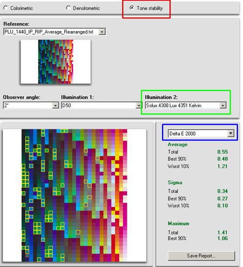
Tone stability [Red Box in Figure 1 above] under different
light sources was analyzed using the the “Comparing” Function
of the Measure Tool application, which is part of the Profilemaker
Pro 5
suite from Gretagmacbeth. The reference illuminant (Illuminant 1, which
in
our case is D50) and the comparison illuminant [Green box in Figure
1] can be selected. Illuminants were either standard ones supplied
with the Profilemaker application:
- D65
- CWF2 – Cool White Fluorescent
- Incandescent Illuminant A
or measured with the Eye One Pro spectrophotometer with Ambient Light
Head:
- Office East Wall – the illumination (fluorescent, unknown
bulbs) in my office
- Just Colormaster – the Just Colormaster
Duo viewing box (specially made fluorescent bulbs to try to match
D50)
- Solux 4308 Lux 4351
Kelvin – Solux clip-on
lamp with 4700
degree Kelvin bulb (36 degree beam spread), at 8-10 inches
away
[Note: 4351 Kelvin was the actual correlated color
temperature measured by the Eye One Pro for the 4700
Kelvin bulb.Measurements with a Color Temperature meter
showed that the color temperature varied with the distance
from the Solux lamp. At 3 inches from the lamp, the
value was 4670. The lower value was measured at 8-10
inches.]
The ambient light sources were measured for emission of light every
10 nm between 380 nm and 730 nm. Figure 2 shows graphs (produced in
a spreadsheet with the data from the CXF file) of two measured light
sources. Note the spikes in the fluorescent lighting between 540 and
610 nm.
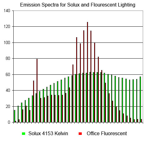
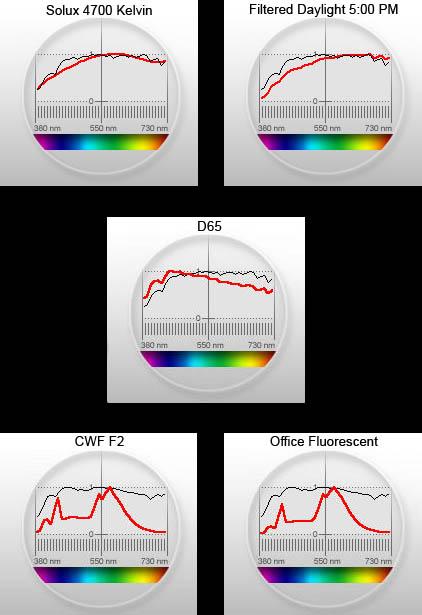
Figure 3 shows spectral emission of various light sources compared
to D50 (gray line):
Interpretation
The difference between the colors under the two illuminants is described
quantitatively by a measurement called Delta E [Blue box in Figure
1]. Delta E interpretation:
A color difference of 1 Delta E corresponds to a barely noticeable
difference by 50% of the persons comparing the two patches. In general,
Delta E of greater than 3 may be observed in real world images.
There are different formulas to calculate delta E. The original formula
overestimates the degree of difference for large differences in color,
so I decided to compare using delta E 2000. According to color management
guru Bruce Fraser, Delta E 2000 “provides a more accurate gauge
of perceived color differences than older systems”.
The worst 10% of patches (most perceived change) are outlined in yellow,
the worst match is outlined in red. The average, standard deviation
(sigma) and maximum are provided for the total (all patches), the best
90% and the worst 10%.
Below are screen captures for Solux and CWF compared to D50:
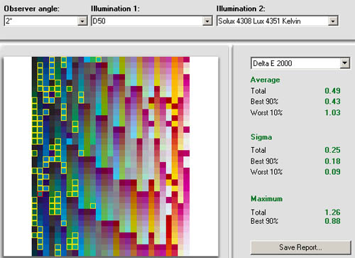
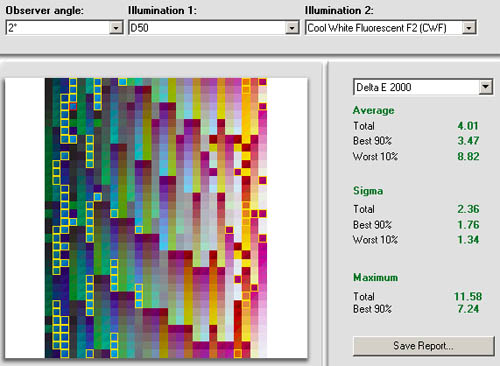
Note that the worst 10% of patches have a Delta E 2000 of only 1 for
the Solux Lamp, but over 8 for the fluorescent. Also, my office fluorescent
lighting is even worse than CWF F2 standard. So that's why those photos
didn't look right!
Please note that the images are screen captures (SRGB) and thus will
not accurately reflect the actual colors, but probably give some
idea of the magnitude of the differences. Also note that some of the
colors
are outside the gamut of the display.
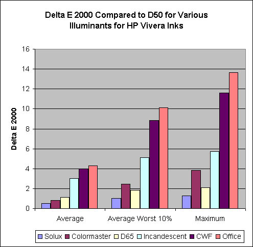
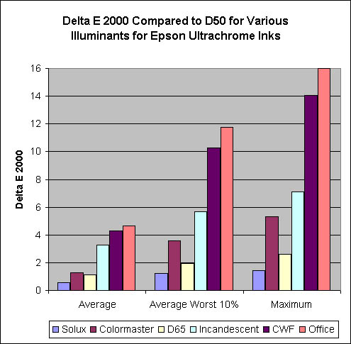
To put all of this data in perspective, I created two graphs summarizing
the most important Delta E 2000 averages, one for Ultrachrome and the
other for Vivera Inks. Each shows comparisons among different illuminants
for the Average Delta E 2000, the Average Delta E 2000 for the worst
10% of patches, and the Maximum Delta E 2000 (the very worst patch):
In order to allow you to study these results at your leisure, I have
put all of the results for both ink sets in a single TIFF file (Tone
Stability Comparison) on separate layers. You can open the TIFF files
in Photoshop and zoom in to 300-400% to see the comparisons more clearly.
Clicking a layer on and off will give you a good visual comparison
of what colors are most affected by using a particular light source.
Please note that Epson results cannot be compared directly with HP
results as far as actual color is concerned. This is because the files
were made by sending the same numbers to the printers (untagged RGB),
so the workflow was NOT color managed. There is also a summary file
for the HP Designjet (DJ 130 Tone Stability Summary), which shows all
of the averages, standard deviations, and other figures on one layer.
There is one layer showing Delta E and another layer showing Delta
E 2000. No summary file is included for the Epson 2200. I have included
a file showing spectral comparison of different illuminants to D50.
Finally there are graphs of Delta E 2000 Average, Average Worst 10%,
and Maximum for both Ultrachrome and Vivera Inks. The Zip file can
be downloaded here [link
to zip file].
Summary
- The Solux clip-on task lamp ($70 including shipping) was the closest
match to D50, beating out the much more expensive viewing box from
Just Normlicht.
However, the Just Normlicht has a dimmer control to match
the light intensity to the monitor. To use the Solux for monitor
to print match you would have to adjust the distance of the
Solux from the print.
- For display of prints under Solux 4700
degree Kelvin lamp, no compensation needed in profile to
achieve the same look.
- For display of prints under Incandescent
lighting, a custom profile to match the illuminant is only needed
if the match
is critical. If you are using Gretagmacbeth software, you
need Profilemaker Pro for this capability (Eye One Match won't
do it).
- For display of prints under fluorescent lighting, a custom
profile to match the illuminant is strongly recommended.
- Designjet
130 dye inks had slightly greater tone stability under different
illuminants than Epson pigment Ultrachrome
inks, but this was only enough to be significant for fluorescent
(office) lighting.
I found all this information quite “illuminating” :-)
Links/Background Reading
Information on different illuminants:
Information on Delta E:
Disclosure
The author has a strong relationship with the D50 and D65 light sources
(i.e., he spends as much time outdoors as possible). The remaining
light sources were borrowed or purchased with his own funds. He has
no relationship with any manufacturer other than using their hardware
or software.
|